For most of us, 2020 was a tough year. Many businesses had to shut their doors forever. Some managed to recover. Yet some of the online industries were bound to grow in the year of the global lockdowns. eCommerce is one of those. Shopify has seen its stock price rise by about 2.6x over the past 12 months.
I see local offline boutiques going online. I see friends of mine start successfully selling stuff on Amazon and other marketplaces without any background in eCommerce.
Most likely the trends will strengthen in 2021 and we’ll see more and more fully online and remote businesses all over the world.
I wouldn’t say eCommerce hasn’t suffered at all. We’ve seen a 15-25% drop in sales amid general panic in March-April, however, most of the merchants we know eventually recovered by June. Things got more complicated mostly because of the issues in the supply chain.
If I started dropshipping or selling online in 2021, I would go with one of the following categories:
- Sports (outdoor and bodyweight minimalist solutions particularly – gyms are still closed in many countries and lots of people enjoy calisthenics, resistance band training, running, hiking, etc)
- Wellness (self-care, meditation, stress relief)
- Hygge lifestyle and home stuff (aromatherapy boomed last year, for instance. people stay home and try to make this experience enjoyable)
- Home office setups (people saved some bucks eliminating the commute and ready to invest in their home workstations. See #setupinspiration on Instagram )
So let’s compile the eCommerce checklist for those starting up in 2021. Some of the recommendations would seem obvious for those in the industry for a while, but for some reason, even big brands choose odd solutions (Sorry Zara)
Platform
We normally offer our clients one of the following platform options:
- Magento 2
- Opencart
- Shopify
The first two options are both Open-source and that’s where it would be appropriate to compare. Depending on the projected load, budgets, and the number of SKUs I normally recommend the client the most adequate solution.
Magento is most suitable for large merchants with thousands of products, but the development and maintenance costs are much higher compared to Opencart, where you can get your eCommerce website up and running for as little as 5K EUR. It has some limitations though and would not match Magento’s multivendor capabilities and scalability. Both solutions have marketplaces, where you can find addons virtually for every need. But we’ll stop here and I’ll make a dedicated post about the cons and pros of each platform soon.
For those starting their first eCommerce business, I would recommend Shopify. It’s absolutely the best in terms of:
- Time to market (when you don’t need serious customization you can launch your eCommerce store within few days)
- Recurring tech expenses are almost inexistent
- UX and Shopify Checkout particularly are brilliant and optimized for conversion out of the box
Mobile-first
You have probably noticed Facebook’s desktop version now looks like you accidentally opened a mobile version. The huge mobile app on a 4K display.
/cdn.vox-cdn.com/uploads/chorus_asset/file/16202304/facebook_website_redesign_1.jpg)
Back in 2015, we did very well with a minimal care of website mobile readiness. Most of our traffic was “Desktop” and we haven’t seen significant improvement in sales developing a proper mobile commerce solution. Things rapidly changed in 2017, the share of the mobile traffic (mobile and tablet combined) grew significantly and we had to react fast to maintain the conversion rates.
If you’re on Magento and struggle to fight for an optimal mobile experience, I suggest considering switching to PWA storefront (VueStorefront or ScandiPWA: Vue-based and Angular-base respectively). That saves development time a lot. As the result, you have the power of Magento backend and the speed and flexibility of javascript. Additionally, it will be much easier to find engineers for your frontend needs.
Long story short, starting July 1, 2019, Google has enabled mobile-first indexing by default for all new websites. That affects your SEO rankings. But what’s arguably more important than how Google’s robot sees your online store – it is how your client does. Remember, in 2021 most of the traffic is mobile. Period.
Navigation
I want to stress this one. I still see a lot of websites messing up navigation. It should be simple right? Let’s try to understand the basics. When we speak about navigation we immediately think about the main menu. The menu normally represents a set of parent product collections, their child groups, and static pages like “home” and “contact“. Easy right? The parent product collections can group your products by their unique characteristic (men/women/unisex or shoes/accessories/outerwear) or by action (read/listen) for instance. We had a healthcare merchant and the products were grouped by their function – acupressure, decompression, massage. In the previous versions of the website, we used the pathologies our products address. You got the idea. What you don’t want to do is to mix the approaches and confuse the visitors of your shop. Although it may seem a bit old-school, in my opinion, it’s still a good idea to use filters instead of sub-categories where possible.
But navigations are not always on the main menu. We got a footer menu which frequently acts as a place where we put the links we have to put (Terms and Conditions, Return policy) but hope nobody will ever find them. I suggest adding customer reassurance blocks in the footer (Trustpilot, Partner badges, Awards) and make sure it’s visible. No point to have them if you have the infinite scroll and lots of content to keep your client busy scrolling all the way down.
I’ve seen a lot of shops neglecting the breadcrumbs. In extreme cases, you won’t see the breadcrumbs at all. Not only it possibly harms your SEO (hard to tell how much exactly though…), it also leaves your client with options: click “Back” and in some cases, it sends you straight to the homepage (one-page web-apps), and going through the whole navigation voyage, where experience is directly related to how conscientiously the main menu was implemented.
The main menu should be accessible, clear, and always visible. The only moment you can hide navigation is checkout, where you do not want to distract your customer from finishing the purchase.
Basic SEO
Most of the eCommerce platforms have built-in SEO tools. The starter option normally represents the meta-tag editor. It’s a must, but not enough in 2021. Nowadays, search engines want us to deliver quality content. Make sure you provide unique product descriptions for as many products as you can. That should include a detailed description of the product benefits and value it brings to the customer. Ideally, it should demonstrate the product in use by the human being (where applicable. e.g. if it’s a watch, show it on a human hand in additional images).
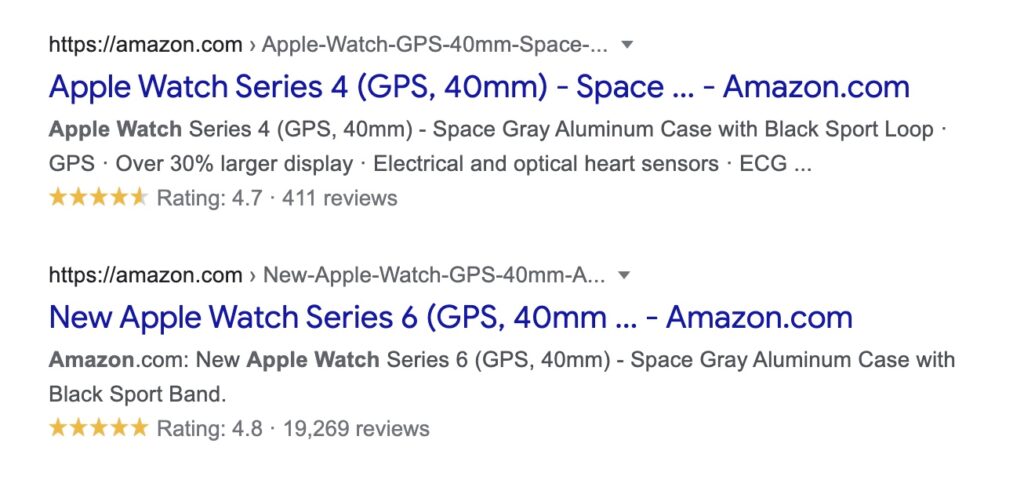
Don’t forget the rich snippets. Get familiar with Schema.org to make use of the benefits rich snippets may provide. With Schema you can include some extra information that may help you get featured within search results.

I could leave this without a note, but just in case. Always make sure your website is open for search engines.
Shopify + SEO deserve a dedicated post and I promise you’ll get it. I guess there are still a lot of merchants googling if Shopify allows editing robots.txt file. Short answer: no it doesn’t.
Reviews
Make sure you show reviews for as many products as you can. If you don’t have enough product-specific reviews, showcase reviews for your brand. According to BrightLocal’s local consumer survey, 91% of consumers between 18 and 34 believe online reviews a lot and the effect is comparable to that of personal recommendations.
If you just start selling online, make it your priority to collect as many positive reviews as possible. As soon as possible.
Returns
Make your return policy your advantage. Many merchants try to avoid returns at all costs. Don’t sacrifice the reputation of your company. The only way you can minimize the return rate is:
- Provide quality goods
- Work with reliable carriers
- Provide exceptional customer service and post-sales support
You can iron the negative experience in many cases if your brand speaks to the customer.
Free shipping or flat rate shipping
Offer free shipping if you can afford it. I work in eCommerce for quite a long time, but I still hate to pay for delivery. When I land on the website I’m not a loyal customer for, it’s always a hidden and unexpected fee for me. Alternatively, you can make an adequate flat rate shipping.
In any case, set the expectation in the very beginning. Let your customer know free shipping is offered. Or make a sticky badge like “Only $10 Worldwide”. Believe me, this simple measure cuts the number of abandoned carts!
Taxes
Always show products with VAT! Nothing disappoints your client more than a 15-25% extra charge after the goods are already added to cart. Only 15-25% VAT charge and unexpected shipping fees combined…
Clear communication, tracking numbers
Speaking about communication, transactional emails is an absolute minimum for an eCommerce website. And this is the absolute minimum of the emails to be sent to your customer considering you allow guest checkout:
- The order confirmation (order is confirmed and ready to be shipped)
- The order has been shipped (should confirm the shipping company it was shipped with and the ETA)
- Shipping update (tracking number if wasn’t known before)
- Review request and return instructions
If a tracking number was not available when the customer was initially notified that the order was shipped, please make sure you send it as a separate mail! This is a part of the customer experience and it makes the client feel he’s not forgotten after he paid. And again it gives clear expectations.
Again, I emphasize you should remind your client she has the right to return the product. Just accept the fact, you won’t avoid the returns. And at the end of the day, it’s just a metric in your business. Believe me or not, you can get your returns as low as 3-5% by providing exceptional customer service, even if you keep your return policy explicit.
LiveChats – another good way to communicate with your clients, but in some cases, it’s really hard to implement (high load & human resource-wise). If you can afford a good Chatbot – definitely go for it. If your chatbot is not AI-driven, forget about it. Imagine a pissed-off buyer who has a question in the middle of checkout and the bot keeps saying “Sorry I didn’t quite understand..” just because its interlocutor doesn’t respect the syntax…
Checkout
If I am asked to mention just one reason for my love for Shopify, I would say, it’s checkout.
With Magento and Opencart we played a lot with different checkout layouts, modules, custom solutions. One thing was obvious – the only adequate solution, since Amazon first offered it, is one step checkout. No more accordion checkouts and other wrist trainers. And once again, with one step checkout, you set the expectations and leave no bad surprises for the customer.

Shopify doesn’t offer the pure one-stepper anymore. But somehow it’s still minimal, smooth, and less demanding for your clicks.
Stay tuned
That’s just a second post in this blog, but if you found this article any useful, feel free to subscribe, that would be a good signal I should keep posting:
